Write a React or Solid tree in TypeScript. GPUIX paints it with Metal, DirectX, or Vulkan. No Electron. No web view.
useState and JSX still apply. Layout, text, and input go through GPUI, not the DOM.
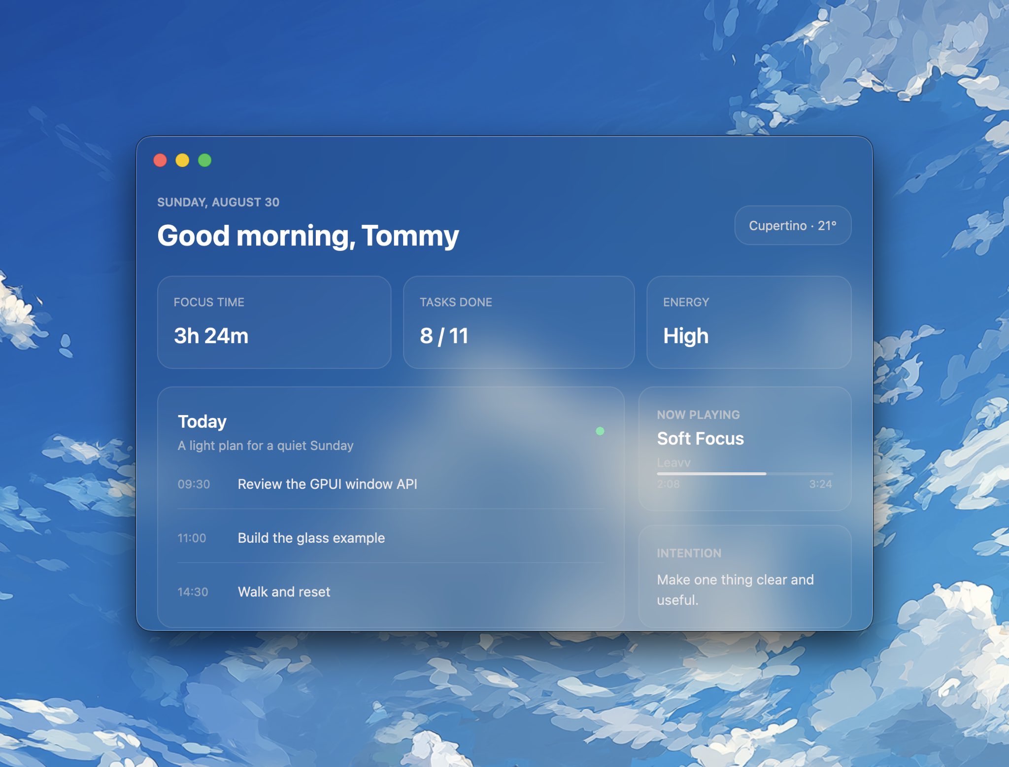
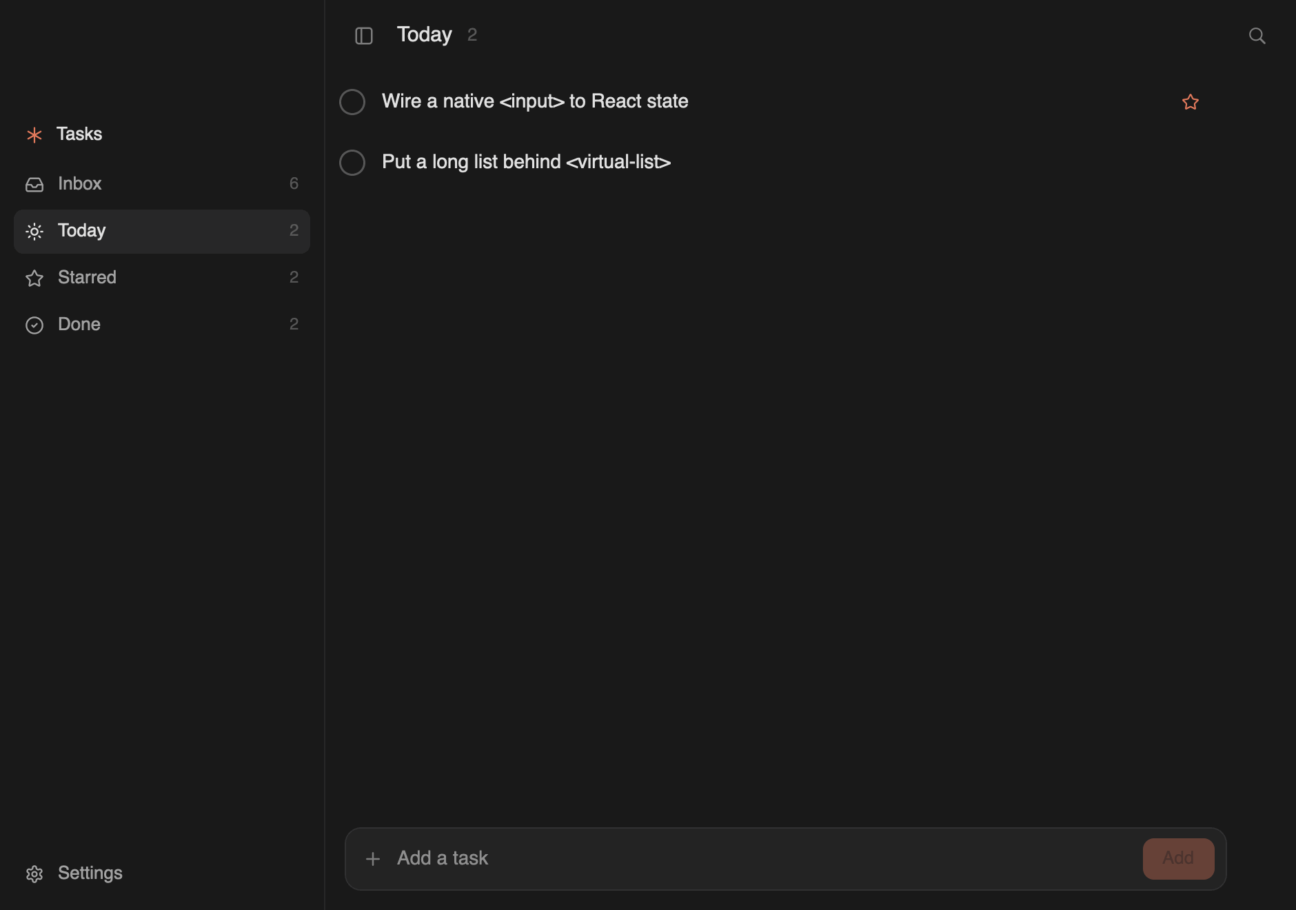
Everything above is GPUIX: the glass window, the cards, the schedule,
and native text.
Quickstart
Create an app from the official example. The command downloads only
example-app/ and installs its dependencies. There is no repository clone,
native build, or Rust toolchain.
123bunx@gpuix/cli new my-app
cd my-app
bun run dev
@gpuix/react pulls the native renderer for your platform. Edit app.tsx and
the running window remounts on save. Click and keyboard handlers switch to the
new tree without recreating the window.
Install the packages directly when you do not want the example app:
12bun add --exact@gpuix/react@gpuix/native react
bun add -d@types/react typescript
Pin your adapter and @gpuix/native to the same exact version. GPUIX is
still pre-1.0, so a new release can break either package. The adapter pulls
@gpuix/native with a version range, and that range can install a newer native
binary under an older adapter. Add both as direct dependencies. Upgrade them
together.
1. Point TypeScript at the GPUIX JSX types
jsxImportSource is required. Without it TypeScript uses DOM types, so
<virtual-list>, <markdown>, <code> and style.hover all fail to
typecheck.
The binary carries the renderer, so it runs with no Bun and no Node install.
For a smaller ship set, run the same React app on
hermes-node instead of Bun. That path is
12 MB plus a 22 MB native sidecar. The steps are in that guide.
Hermes needs the .node next to the exe. List it as a second binary,
not a resource. Resources go in Contents/Resources. dlopen looks in
Contents/MacOS.
On this machine the Bun chat .app is 82 MB. The Hermes counter .app
is 34 MB.
6. Auto-update
Packaging does not turn on updates. The running app calls
checkUpdate on @gpuix/native. HTTP uses the same reqwest_client as
<img>. There is no second native addon.
Host on GitHub Releases. Create the release first. CI packs on each OS,
signs, and uploads the bundle plus its .sig. The app hits
https://github.com/OWNER/REPO/releases/latest. That rewrites to
https://api.github.com/repos/OWNER/REPO/releases/latest. The updater
reads tag_name and assets, then GETs the sibling {name}.sig.
Sign once:
1cargo packager signer generate
Store the private key and its password as repo secrets
CARGO_PACKAGER_SIGN_PRIVATE_KEY and
CARGO_PACKAGER_SIGN_PRIVATE_KEY_PASSWORD. Put the public key in the app.
https://github.com/OWNER/REPO is the same endpoint.
Packager only builds the host OS. Run it on macOS, Linux, and Windows.
--release is the packager profile (look in binariesDir for a release
binary). It is not cargo build --release. Signing is automatic when those
two env vars are set. Source:
cargo-packager CLI.
With productName: "My App", version: "0.1.0", and
binaries: [{ "path": "app", "main": true }], packager writes:
OS
formats
Files in outDir (bundle/)
macOS
"app"
My App.app, then on sign My App.app.tar.gz + My App.app.tar.gz.sig
Linux
"appimage"
app_0.1.0_x86_64.AppImage + .sig
Windows
"nsis"
app_0.1.0_x64-setup.exe + .sig
The macOS updater wants the .app.tar.gz, not the .app and not a
.dmg. Packager tars the .app only when it signs. Linux and Windows names
use the binary stem (app), not productName. NSIS arch is x64, not
x86_64. A missing sibling .sig is an error.
Create the GitHub release yourself, then pack and upload. --clobber
replaces an asset if CI retries. Do not upload a feed JSON.
downloadAndInstall() replaces the packaged files. It does not relaunch.
Quit after it returns, or the next start uses the new app.
HTTPS is in the native crate. This works on Bun and hermes-node. It
does not exist in the browser wasm build. The repo must be public, or
GitHub will 404 the API. Optional: put a Cloudflare cache in front of
api.github.com. Same GitHub JSON. Not a custom schema.
Start from the example app
example-app/ is a complete todo app in one file, with dev,
build, web:dev and typecheck scripts already wired. Create a copy with
bunx @gpuix/cli new my-app.
A video-editor timeline: clip dragging, edge trimming with snapping, playhead scrubbing, marquee selection, zoom under the pointer, and a two-axis pan with a frozen ruler and track column
mail
bun --hot mail.tsx
A Superhuman-style mail client: three panes, thread list, and a Framer newsletter
native-text
bun --hot native-text.tsx
The three native text components with a tab switcher
counter
bun --hot counter.tsx
The smallest possible app: state, events, hover
diff
bun --hot diff.tsx
A diff viewer composed from <div> and <text> in JS, for comparison
web
bun run web from the repository root
The ChatGPT example rendered in a browser canvas with WebGPU
The todo app lives in example-app/ and is meant to be copied with bunx @gpuix/cli new.
The rest live in examples/. Those bun --hot commands need a clone of this repo and a local native build. They will not run against the published packages alone.
Or download a standalone chat build from the GitHub release. No Bun or Rust install is required.
The archive keeps the executable bit, so there is no chmod step. macOS may still block the unsigned binary the first time. Right-click the file, choose Open, and confirm.
On Windows, download example-chat-x86_64-pc-windows-msvc.exe and double-click it. On Linux, the file is example-chat-x86_64-unknown-linux-gnu.tar.gz.
The web example bundles the same React app and reconciler as the desktop chat
example. wasm-bindgen exposes mutations and event callbacks to the existing
retained tree and GpuixView, which run through GPUI's browser platform.
The web build needs nightly Rust and the matching wasm-bindgen CLI:
123rustup toolchain install nightly --component rust-src --target wasm32-unknown-unknown
cargo install wasm-bindgen-cli --version0.2.127 --lockedbun run web
The generated Wasm uses shared memory, so the page must be cross-origin
isolated. Production servers must send these headers on the top-level
document:
require-corp then constrains cross-origin subresources, which must supply
their own CORS or Cross-Origin-Resource-Policy. Serve the JavaScript and the
Wasm from the same origin as the document and nothing else is needed.
bun run web rebuilds the Wasm only when packages/native/wasm is missing.
After a Rust change, force it:
1bun scripts/web.ts --rebuild
Hot reload in the browser
bun run web serves the example through Bun's frontend dev server, so an edit
to examples/chat.tsx arrives as a React Fast Refresh update. Components
swap in place and useState survives, which means the composer text, the
sidebar selection, and the scroll position all stay where they were. The GPUI
canvas is never re-created and the ~19 MB Wasm module is never re-fetched.
Fast Refresh only applies to a module whose exports are all components. Edit
anything else, such as the entry file, and Bun reloads the page instead. Both
paths are correct; the reload is only slower.
The Wasm half is a singleton and must never re-evaluate.
WebGpuixRenderer::init fails with GPUIX web is already running once its
thread-local app exists, and GPUI's browser platform appends its own canvas to
<body>. What protects it is not that it lives in node_modules; Bun bundles
it into the same client registry as your app. It is that Bun re-runs only the
changed module and then walks upward through its importers, so an unchanged
dependency stays evaluated and cached. Two rules follow:
do not call import.meta.hot.accept("./your-app", ...) in the entry file.
Bun runs an importer's dependency-accept callback even when the imported
module already self-accepted, so that callback would remount the tree on top
of a successful refresh and throw away every useState
keep the @gpuix/native import in a module that can never become a Refresh
boundary and is never explicitly accepted
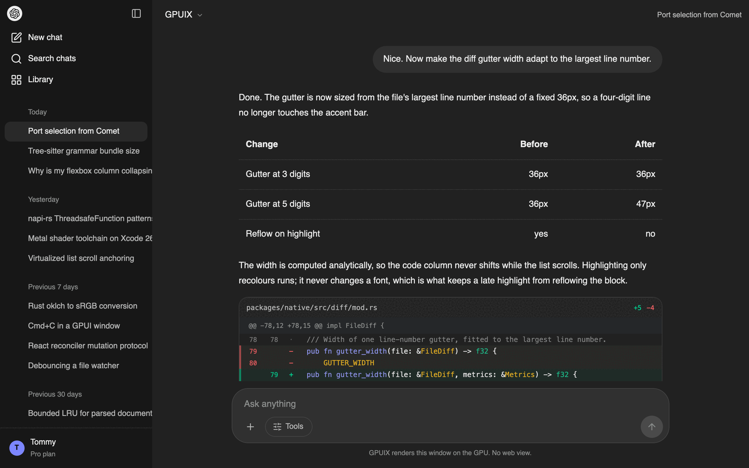
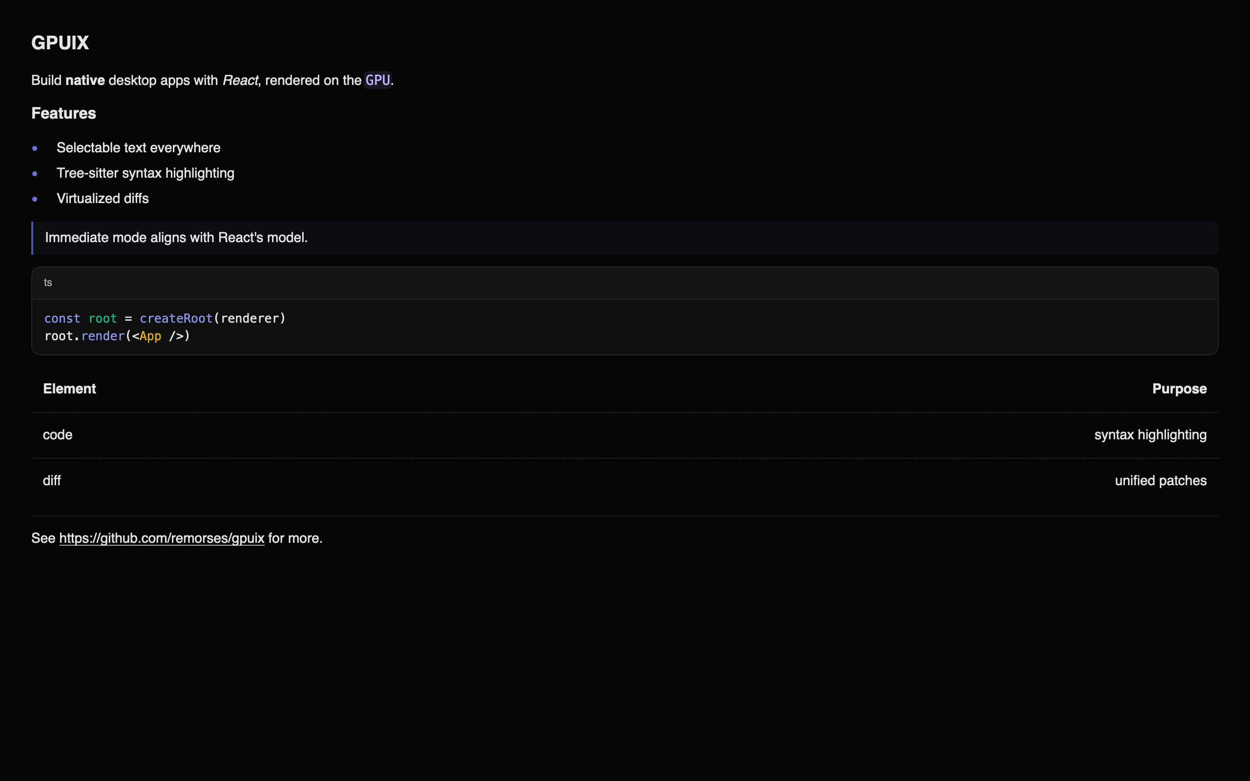
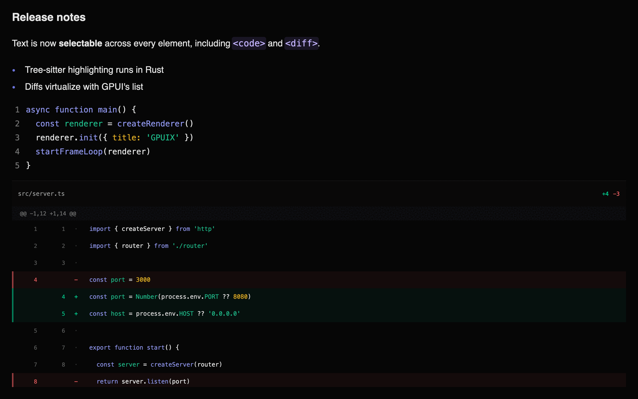
The chat example puts a virtualized <diff> and a GFM table inside an assistant
turn, inside a scrolling transcript:
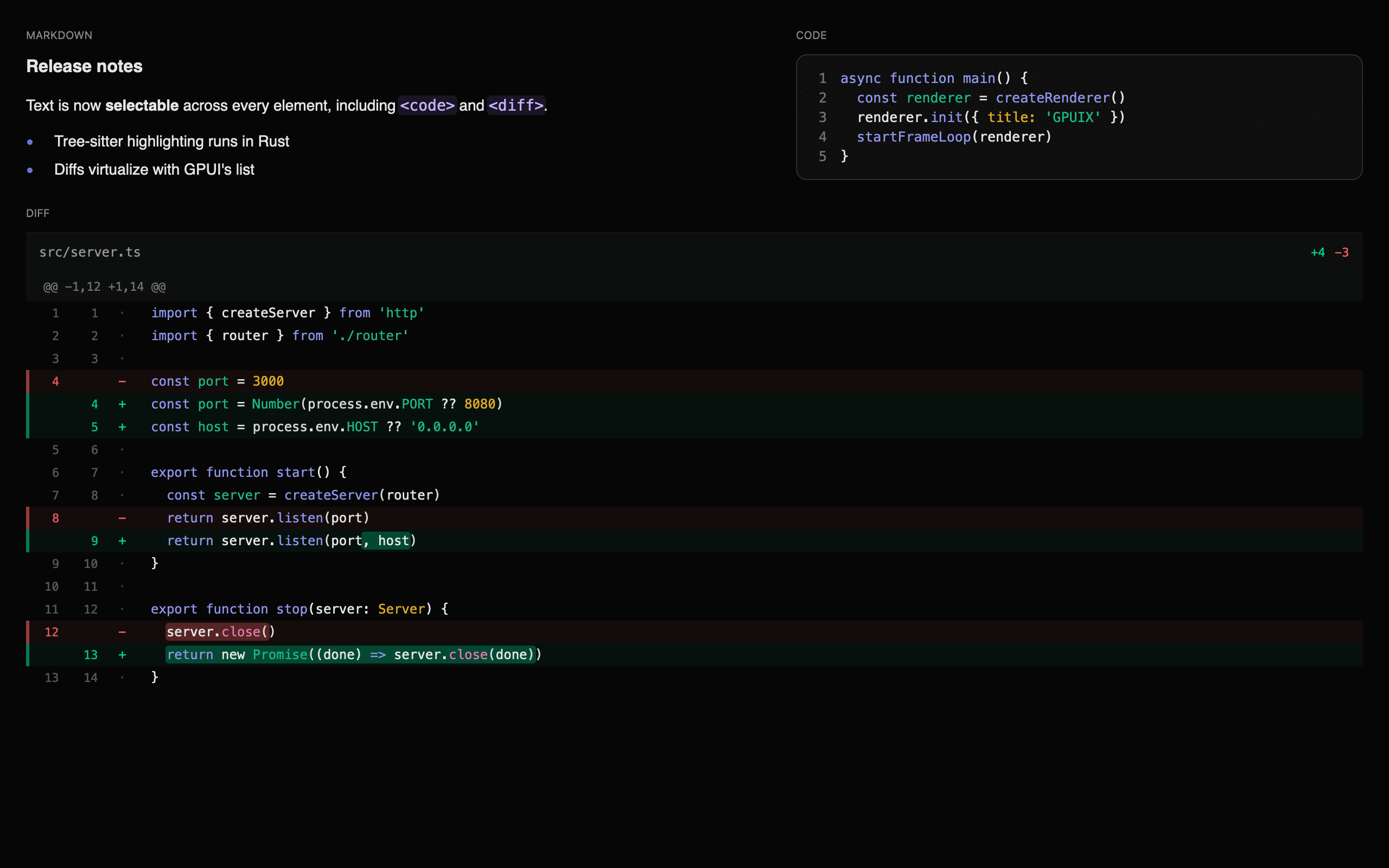
Markdown, code and a virtualized diff in one frame:
Architecture
GPUIX bridges React and Solid to GPUI using a shared mutation-based runtime.
Desktop apps use napi-rs; browser apps load the same Rust renderer through
wasm-bindgen. Each framework adapter collects changed elements into one atomic
mutation batch. Rust applies that batch to a retained element tree that GPUI
reads each frame.
GPUI is an immediate-mode UI framework — it rebuilds the entire element tree every frame. Instead of fighting this, GPUIX embraces it:
The React or Solid adapter detects a state change and queues host mutations (createElement, setStyle, appendChild, etc.)
applyBatch() validates and applies the complete commit to the Rust RetainedTree
On each GPUI frame, GpuixView::render() walks the RetainedTree and calls build_element() to produce ephemeral GPUI elements
GPUI lays them out (Taffy flexbox) and renders to the GPU
Only changed elements cross the FFI boundary. The framework adapter sends minimal mutations
React and Solid use the same IDs, mutation queue, event routing, testing API,
automation client, observers, and text-search matcher. Their framework-specific
schedulers and component contexts stay in the adapter packages.
Mutation API
The mutation surface between JS and Rust is one atomic method. Desktop uses napi and the browser uses wasm-bindgen:
createMutationQueue only needs that. Window size, focus, and selection use smaller host types (WindowSizeHost, SelectionHost). NativeRenderer is MutationHost plus those methods, so a fake can implement applyBatch alone.
Element IDs are plain numbers generated by an incrementing counter in JS. React may abandon work in concurrent render mode, so GPUIX keeps new host nodes in JS until React places the accepted subtree during commit. Only then are its mutations added to the batch. applyBatch() applies that accepted commit atomically and marks the Rust view dirty for the next frame.
Event Flow
Events travel from GPUI back to React through a ThreadsafeFunction on desktop
and a wasm-bindgen callback in the browser.
12345678910111213141516171819User clicks element id=3
│
▼
GPUI fires on_click on the element
│
▼
Rust closure calls emit_event_full(callback, 3, "click", {x, y, ...})
│
▼
Desktop ThreadsafeFunction / browser callback sends EventPayload
│
▼
JS event registry: eventHandlers.get(3)?.get("click")?.(payload)
│
▼
React handler runs: onClick={()=> setCount(c => c + 1)}
│
▼
State update triggers re-render → reconciler sends mutations back to Rust
Event handlers are stored in a JS-side registry keyed by (elementId, eventType). Rust only knows whether an element has a listener (via setEventListener), not the closure itself — the actual handler lives in JS.
Packages
@gpuix/native: Rust bindings plus the framework-neutral TypeScript host runtime. It owns host types, mutation batching, renderer state, event routing, observers, native testing, and automation.
@gpuix/native/host: host contracts, mutation helpers, renderer ownership, window observers, selection observation, and text search. Importing it does not load the .node addon.
@gpuix/native/testing: the shared TestRenderer over the real TestGpuixRenderer.
@gpuix/native/automation: the shared automation protocol, client, locators, and process launcher.
@gpuix/react: the React reconciler and React components. It preserves its existing exports and re-exports shared testing, automation, search, and observer APIs.
@gpuix/solid: the Solid 1 universal renderer, Solid primitives, motion, Select, Combobox, Tooltip, Bun preload, and build plugin.
@gpuix/cli — gpuix new downloads example-app/, sets its published React dependency, and installs it as a standalone project.
Pin the selected adapter and @gpuix/native to the same exact version.
GPUIX is still pre-1.0. Breaking changes can land before v1. Upgrade them
together.
Use Solid's preserved JSX. The preload compiles application .tsx and .jsx
files for Solid's universal renderer and selects the reactive client runtime.
This section is for working on GPUIX itself. To build an app with it, see
Quickstart instead. Installing the packages needs no Rust
toolchain and no submodule.
Prerequisites
Rust toolchain
Node.js 18+
Xcode with Metal Toolchain (macOS)
123456789101112131415161718192021222324# Install Metal Toolchain if neededxcodebuild-downloadComponent MetalToolchain
# Install dependenciesbun install
# Check out the pinned GPUI forkgit submodule update --init--recursive# Build native packagecd packages/native
bun run build
# Build React packagecd../react
bun run build
# Build Solid packagecd../solid
bun run build
# Run example (use tmux for long-running sessions)cd../../examples
bun--hot counter.tsx
render() creates the native window, mounts React, and starts the frame loop.
The red traffic-light button quits the process. Start the app again from the
terminal.
Option
Values
Purpose
titlebarTransparent
boolean
Hide the native titlebar so the app draws chrome under the traffic lights
windowBackground
"opaque" (default), "transparent", "blurred"
Window fill. "blurred" is the macOS vibrancy backdrop
trafficLightX / trafficLightY
pixels
Traffic-light origin. The chat example uses (16, 17)
transparent
boolean
Same as windowBackground: "transparent" when that option is unset
appName
string
Name inside the macOS Hide X and Quit X items. Defaults to title
focus
boolean, default true
false opens the window behind the active app, like open -g
show
boolean, default true
false opens the window hidden. Call activateWindow() to reveal it
Call it again after a save and it remounts the tree on the same window.
The macOS menu bar
GPUIX installs the application menu bar for you, so a fresh app already answers
⌘Q, ⌘H, ⌥⌘H, ⌘M, and ⌘W. Without it NSApp.mainMenu is nil, macOS
paints an empty menu bar, and those shortcuts do not exist at all: AppKit only
provides them through menu items.
appName does not set the title of the application menu. macOS takes that
from the executable, so bun app.tsx shows bun during development and a
bun build --compile binary shows its own file name. Only a real .app bundle
changes it. appName reaches the items inside the menu, and nothing else.
There is no Edit menu, on purpose. A menu key equivalent is consumed by
AppKit before the window sees the key event, so an Edit menu carrying ⌘C
would take the keystroke away from text selection and from <input>.
Use render(), not createRenderer(), in the app entry. bun --hot
re-runs the whole file on save. createRenderer() plus init() would then
build a second host. render() is idempotent: the first call owns the window,
later calls only remount React.
createRenderer(), createRoot(), and startFrameLoop() stay public for
tests and custom hosts. Pass { renderer } into render() when you already
have one.
One renderer drives one root. A renderer owns one window, one native root
id, and one event map, so createRoot() throws if that renderer already has a
mounted root. Call unmount() on the first root before you create another;
render() already does that for you.
Background launch
focus: false opens the window without taking focus. The app you were
typing in keeps the caret and the active titlebar. show: false goes further
and opens no window at all, so the process runs with a live React tree and
nothing on screen.
1render(<App/>,{ title:'Notes', focus:false})
Turn this on whenever a coding agent runs your app. An agent that starts
the app to check its work will otherwise yank the window in front of whatever
you are doing, mid-sentence, once per iteration. With focus: false the agent
still gets a real GPU-rendered window it can screenshot and click, and you keep
your editor. See Let an agent drive the app.
activateWindow() brings the window forward and focuses it. It is the only way
to reveal a show: false window. Reach it from any component with
useGpuixRequired():
Outside React, call it on the renderer that createRenderer() returned.
Window controls
The desktop renderer exposes GPUI's native minimize, zoom, and fullscreen
operations. Reach them through useGpuixRequired() or the renderer returned by
createRenderer().
minimizeWindow(), zoomWindow(), and toggleFullscreen() work on macOS,
Windows, Linux, and FreeBSD. zoomWindow() uses the platform's native zoom or
maximize operation. These methods are not available in the browser renderer.
File picker
promptForPaths() opens the operating system's file picker. It resolves with
the selected absolute paths, or null when the user cancels.
With no options, the picker selects one file. Set directories: true to select
directories instead. macOS can select files and directories in one prompt;
Windows and Linux require one kind per prompt. Invalid options and platform
picker failures reject. The browser method rejects because browsers return
File objects, not operating-system paths. An injected custom renderer can
omit this optional capability.
On the current Windows GPUI backend, the system dialog does not distinguish
cancellation from other IFileDialog::Show errors, so both resolve with
null. This needs a fix in GPUI before GPUIX can report those errors.
Platform
focus: false
show: false
macOS
window orders in front without becoming key, like open -g
honored
Windows
SW_SHOWNOACTIVATE
honored
Linux
ignored, the window opens focused
ignored
The process still gets a Dock icon on macOS. GPUI sets the regular
activation policy, so there is no menu-bar-agent mode yet. For a real
background daemon, run the app from a launchd agent in
~/Library/LaunchAgents/; launchd never activates the process.
Let an agent drive the app
Make focus opt-in through the environment, so a human run behaves normally and
an agent run stays out of the way:
12bun app.tsx # you: window comes to the frontGPUIX_BACKGROUND=1 bun app.tsx # agent: window opens behind your editor
launch() passes env straight through, so an agent script sets it once and
every screenshot, click, and assertion runs on a window that never interrupts
you:
Focus is the only thing that changes. Automation does not need focus.click() hits the last painted bounds and screenshot() reads the GPU
surface, so both work while the window sits behind your editor, and even on a
show: false window that is not on screen at all.
1234567891011agent ──► launch({ env: { GPUIX_BACKGROUND: '1'}})
│
▼
GPU window renders and paints without activation
│
├──► getByTestId(..).click() ✓ hits the last painted bounds
├──► screenshot({ path }) ✓ reads the GPU surface
├──► fill() / press() ✓ uses the live input pipeline
└──► close()you ──► keep typing, your editor stays frontmost the whole time
fill() and press() use the live GPUI window input pipeline. They work
without activating the desktop window. Linux ignores focus, so an agent
there still gets a focused window.
Prefer createTestRoot() when you can. It opens no window at all, so
nothing can steal focus and keyboard input works. Reach for launch() plus
focus: false when the check needs a real window, real GPU paint, or a real
process.
flushSync
The root is a concurrent root, so React commits in a later microtask.
flushSync forces the render and the commit to finish before it returns, the
same as in react-dom.
It flushes React only, down to one applyBatch call. After it returns the
native retained tree is up to date, including styles and text.
It does not wait for GPUI. Layout and paint still happen on the next frame,
exactly like the browser paints after a DOM mutation. To see pixels, wait a
frame in the app, or call renderer.flush() in a test.
Use it when an ordering bug depends on the commit landing first: an unmount
before a remount, or a state change before you feed the next event.
Debug frame overlay
GPUI paints frame-time stats into the window after layout. The overlay is not
a React element. A React FPS label would update every frame and cause more work.
p90Ms is the overlay 10% line. p99Ms is the 1% line. Those are the slow tail.
The overlay shows draw time, not FPS. 8.3 MS is about 120 Hz.
The chat example has a regression test for this: examples/chat.perf.test.tsx. It times mount, wheel draw, and sidebar clicks. It asserts p95, not every frame.
The default example suite excludes this hardware-timing test so shared CI runner variance does not fail functional checks. Run it explicitly on the target Mac:
On macOS, THROTTLE=utility restarts the process under taskpolicy -c utility. That pins work to E-cores. It is an M1/M2 Air CPU proxy, not Chrome 6x. GPU and RAM stay fast. THROTTLE=background is slower.
123cd examples
THROTTLE=utility bun run test:perf
THROTTLE=utility bun --hot chat.tsx
This is a remount, not React Refresh. Keeping hook state needs Bun to inject
$RefreshReg$ during --hot. That transform exists on
bun build --react-fast-refresh only. Tracked in
oven-sh/bun#40179.
On macOS, startFrameLoop calls renderer.tick() at a fixed rate (~125fps by
default). Each tick drains only ready AppKit events and Core Foundation sources,
then returns without waiting for the next native wake. Bun timers, sockets, promises,
and PTY callbacks can run between ticks. Pass { frameMs } to change the rate, and
call .stop() on the returned handle to end it.
A runtime throw does not freeze the window. The frame loop catches errors from
tick(), native event callbacks catch throws from React handlers, and render()
installs uncaughtException / unhandledRejection listeners so bun stays alive.
The window shows the stack and a Reload button that remounts the last
render() tree. Save under bun --hot also remounts. The process does not
exit.
On Windows and Linux, GPUI runs its normal blocking native event loop on one
dedicated Rust UI thread. tick() does not pump that loop. It only reports
whether the UI thread is still inside Platform::run. startFrameLoop still
creates a JavaScript timer so last-window-close can return false and render()
can process.exit, matching macOS. All platforms use GPUI's native platform,
window, renderer, input, scroll, clipboard, keyboard, and IME implementations.
The embedded macOS run-loop extension comes from the pinned GPUIX fork. CI runs
the full React and example test suites through DirectX on Windows.
Important
On macOS, never drive tick() from a setImmediate loop. That spins at tens of thousands of
ticks per second and burns 73% CPU on a completely idle app, versus 1% when
paced.
Native animations
Use motion.div to animate from an initial style to a target style. React
sends the target once. Rust calculates intermediate values and requests GPUI
frames until the transition finishes, without a React render or N-API call for
each frame.
Set initial={false} when the element must mount at its first animate
target. Later animate changes still transition normally. If a target changes
while motion is active, the next transition starts from the current visible
value, so reversing an animation does not jump.
Targets and timing
Motion currently accepts these numeric targets:
Target
Range or unit
width, height
pixels, zero or greater
top, right, bottom, left
pixels
opacity
0 through 1
borderRadius
pixels, zero or greater
The transition uses seconds, like Motion for React:
Option
Default
Values
duration
0.3
Non-negative seconds
delay
0
Non-negative seconds
ease
"easeOut"
"linear", "ease", "easeIn", "easeOut", "easeInOut", or [x1, y1, x2, y2]
Springs, keyframes, variants, and shared layout animations are not available
yet. Exit uses AnimatePresence, like Motion for React.
Animate a sidebar
Animate an outer clipping container and keep the inner sidebar at a fixed
width. This reveals or hides the content without reflowing its text on every
frame.
The chat example uses this pattern. The sidebar remains mounted while its
outer width moves between 253 and 0 pixels.
Animate unmount
A motion.div with exit only leaves after that target finishes, and only
when it is a child of AnimatePresence. Without AnimatePresence, React
destroys the node on the same commit.
Give every child a unique key when more than one child can leave. Set
initial={false} on AnimatePresence to skip enter on the first paint.
A child with no exit is removed without a tween. Exit still completes when
the target already matches, when the node is outside a virtual list's painted
window, or when invalid runtime data makes the native target unusable.
AnimatePresence also accepts onExitComplete, which runs after every
leaving child is gone. useIsPresent() reports whether a custom descendant is
leaving. usePresence() returns the same status plus safeToRemove, for a
custom exit that decides when the retained child can unmount.
1234567891011import{ usePresence }from'@gpuix/react'functionDeferredRemoval(){const[isPresent, safeToRemove]=usePresence()return(<divonClick={()=>!isPresent && safeToRemove?.()}><text>{isPresent ?'Ready':'Click to remove'}</text></div>)}
motion.div accepts onMotionComplete. It runs when the current native
target settles. If React changes the target before an older completion reaches
JavaScript, the stale completion is ignored.
Capture exact frames
The automation API can freeze the native motion clock and render
specific timestamps. This avoids timer sleeps and gives CI the same frames on
every run.
Containers with overflow: "scroll" become natively scrollable. GPUI handles scroll physics, clipping, and offset persistence automatically.
Plain scroll containers still build every child. Use <virtual-list> below when the collection can grow large.
Important
Nested scrolling is not supported. One parent may scroll. An inner
overflow: "scroll", <virtual-list>, or <diff> must not. GPUI gives both
hitboxes the same wheel event, so the inner list steals the gesture.
Keep long inner content in that parent. Collapse it behind an expandable
(preview plus Show more) instead of giving the child its own viewport.
Horizontal overflow is the exception. overflowX: "scroll" on a wide child
(a code row, a table) does not steal the vertical wheel. GPUIX lays that
scroller out as a flex viewport with minWidth: 0. The wide child must not
shrink: set flexShrink: 0 or a definite width. Swipe on X to pan.
A vertical wheel stays on the parent.
Per-axis scrolling: use overflowX: "scroll" or overflowY: "scroll".
overflow: "scroll" scrolls both axes at once from a single diagonal gesture,
like a browser.
A flex column stretches its children to the cross axis, so a two-axis container
needs its rows to state a width. Without one there is nothing to pan on X:
A native scroll container cannot drive a frozen header. GPUI moves the
container on the wheel frame, and the JavaScript callback that would move the
header arrives a frame later, so the header tears away during a fast pan.
When two panes must stay locked to the pixel, own the offset in React: put one
onScroll listener on a non-scrolling parent, keep scrollX and scrollY in
state, and translate each pane's content with an absolutely positioned wrapper.
Zed does the same; the editor owns its scroll position and paints the gutter and
the text from it.
12345678910functionPane({ offsetX, children }:{ offsetX:number; children:React.ReactNode}){return(<divstyle={{ flexGrow:1, minWidth:0, overflow:'hidden', position:'relative'}}>{/* An empty positioned box still takes hits, so opt it out. */}<divstyle={{ position:'absolute', left:-offsetX, top:0, pointerEvents:'none'}}>{children}</div></div>)}
Keep the moving subtree in a memo component whose props do not change during a
pan. The wheel then costs a handful of style mutations, not one per row. The
timeline example does this for a ruler, a track
column, and a clip grid.
For programmatic scroll, use a host ref. scrollIntoView() walks to the nearest
scroll parent. scrollTo and scrollToItem still exist on the renderer when
you already have an id.
123456789101112131415161718192021functionProgrammaticScroll(){const lastItem =useRef<PublicInstance>(null)return(<><divstyle={{ height:200, overflow:'scroll'}}>{items.map((item, i)=>(<divkey={i}ref={i === items.length-1? lastItem :undefined}>{item}</div>))}</div><divonClick={()=> lastItem.current?.scrollIntoView?.()}>Jump to last</div></>)}
renderer.scrollTo(elementId, x, y)// set offset directly
renderer.scrollToItem(elementId, index)// scroll child into view
renderer.scrollIntoView(elementId)// nearest scroll parent
renderer.getScrollOffset(elementId)// returns [x, y] or null
Virtual lists
Use <virtual-list> for long, variable-height collections such as message lists. React and Rust retain every row, but GPUI only builds, lays out, and paints rows near the viewport.
The list needs a bounded height or bounded flex space. Its direct children are rows and can contain any GPUIX host or custom element.
Prop
Default
Purpose
alignment
"top"
Use "bottom" for chat-style initial positioning
followTail
false
Follow appended rows until the user scrolls away
overdraw
512
Extra pixels built outside the viewport
estimatedItemHeight
none
Height hint for unmeasured rows. Required with itemCount
How virtualization works
React reconciliation stays normal. The complete keyed child list crosses the mutation protocol and remains in Rust's retained tree. GPUIX defers only the expensive GPUI element construction, layout, and paint work.
12345678910111213React Fiber + Rust RetainedTree    all row IDs, props, text, and events
                 │
                 ▼
          GPUI ListState          row count and measured height cache
                 │
                 ▼ visible indexes plus overdraw
          cx.processor            re-enters GpuixView after root render
                 │
                 ▼
          fresh BuildCtx          builds only the requested React subtree
                 │
                 ▼
       GPUI layout and paint      visible rows only
Row heights
Rows do not need equal heights, and you do not need to know them. GPUI measures a row when it enters the viewport. estimatedItemHeight is a hint for rows nothing has measured yet, not a size contract.
123456789index:     0        1        2        3        4        5        6        7
       ┌────────┬────────┬────────┬────────┬────────┬────────┬────────┬────────┐
       │  hint  │  hint  │measured│measured│measured│  hint  │  hint  │  hint  │
       │  220px │  220px │  184px │  512px │   96px │  220px │  220px │  220px │
       └────────┴────────┴────────┴────────┴────────┴────────┴────────┴────────┘
           ▲                          ▲                          ▲
           │                          │                          │
     estimate only         real, variable heights          estimate only
                          (viewport plus overdraw)
The sum of that height cache is the scroll length, so a rough estimate only affects scrollbar accuracy before a row is visited. The measured height replaces the estimate automatically, and the scrollbar converges as you scroll.
When a retained descendant changes, GPUIX marks its direct row for remeasurement, so a streaming row grows correctly. Appending, removing, or reordering keyed rows keeps measurements for rows whose IDs did not change.
estimatedItemHeight is optional in children mode, where every row exists and can be measured. It is required with itemCount, because React never mounts the rows outside the window and native has no element to measure. Those indexes render as an empty box of the estimated height until React mounts the real row.
Row boundaries
Each direct host child is one virtual row. Give every row a stable React key and one host root:
A row can contain nested <div>, <text>, <markdown>, <code>, <diff>, <input>, and <textarea> elements. Focusable rows stay active when they move offscreen, so keyboard input and native editor state are preserved. Those children must not scroll. Nested scrolling is not supported; see Scrolling.
Chat tail behavior
Combine alignment="bottom" and followTail for a chat thread:
The list follows new rows while the user is at the bottom. Scrolling upward pauses tail following. Returning to the bottom enables it again. A streaming final row is remeasured as its content grows.
Scroll anchoring
The list is anchored on a row index, not on a pixel offset. In children mode React reconciles by key, so that index still lands on the same row after a prepend: the rows already on screen stay exactly where they are. A browser does the same, and calls it scroll anchoring.
One exception, also copied from the browser: a top-aligned list that is scrolled to the very top stays at the top, so a prepended row is visible.
1234567scrolled down                          pinned to the top
┌──────────────────┐                   ┌──────────────────┐
│ new row  (above) │  ◄── inserted     │ new row          │  ◄── inserted, visible
├──────────────────┤                   ├──────────────────┤
│ ░░ viewport ░░░░ │  stays put        │ ░░ viewport ░░░░ │  follows the insert
│ ░░░░░░░░░░░░░░░░ │                   │ ░░░░░░░░░░░░░░░░ │
└──────────────────┘                   └──────────────────┘
That is what a todo list or a feed wants: setItems((current) => [fresh, ...current]) puts the new row on screen. A history pane that loads older pages while the user reads should use alignment="bottom" instead, so a page load never moves the text.
With itemCount, the app owns the correction. There is no key to reconcile against, so the index is all there is. Prepending shifts every row down one slot, and the anchor keeps pointing at the old number, so the content slides by exactly the number of rows you inserted. Move windowStart by the same amount:
123456constprepend=(fresh:Row)=>{setRows((current)=>[fresh,...current])// The anchor is an index. One new row above the window means every existing// row moved down one, so the window has to move with it.setWindowStart((start)=>(start ===0?0: start +1))}
Leave windowStart at 0 alone; the list is pinned to the top there and the new row should be visible.
Programmatic scrolling
Use a ref to call the same renderer scroll methods as a plain scroll container:
scrollTo, scrollToItem, and getScrollOffset all support virtual lists.
On a virtual list, scrollToItem takes an optional pixel offset and the
list reports its logical anchor:
12renderer.scrollToItem(listId, index, offsetInItem)// offset in px, may be negative
renderer.getListScrollTop(listId)// [itemIndex, offsetInItemPx, viewportHeightPx] or null
A negative offset anchors the viewport top above the row, and the next
layout resolves it against real measured heights. That is the tool for
infinite-scroll history: while the reader waits in a loading row, read
getListScrollTop, commit the fetched page, then re-anchor on the message
that was under the loading row with a negative offset. The message stays at
the same pixel while the new rows are measured above it —
examples/infinite-chat.tsx is the worked example.
An itemIndex equal to the item count is gpui's at-end sentinel: a
bottom-aligned list resting at its very end. A reader waiting at a trailing
loading row usually sits there, and the viewport height in the same tuple is
what converts that into a position relative to the trailing rows
(EDGE_HEIGHT - viewportHeight in the example).
Virtual-list scrollToItem calls are applied on the next render, after
that frame's child splice, so an index computed against a just-committed
child list is never shifted twice.
Performance model
Work
Plain scroll container
<virtual-list> children
<virtual-list> + itemCount
React Fiber nodes
All rows
All rows
Visible window
Rust retained nodes
All rows
All rows
Visible window
GPUI row construction
All rows
Visible rows plus overdraw
Visible rows plus overdraw
Layout and paint
All rows
Visible rows plus overdraw
Visible rows plus overdraw
Height metadata
None
One lightweight entry per row
One lightweight entry per logical row
The children form still creates every React child, so a 10,000-row turns.map is slow to mount. Pass itemCount and windowStart and render only that slice to mount a window too. Collections with millions of rows still need application-level paging or a data-owning native element.
Keep scroll fast
A wheel event notifies the window view. GPUI then rebuilds the visible
rows and Taffy lays them out again. Draw time is the cost of those rows, not
the length of the list.
Put a long list on <virtual-list>. Keep overdraw near one extra
viewport. Put fat content in one native node (<markdown>, <code>, <diff>),
not a tree of React spans.
The host <virtual-list> still retains every React child. Pass itemCount,
estimatedItemHeight and windowStart, then render only that window, so mount
does not create every row. Native ignores itemCount when the estimate is
missing, so a jump cannot collapse unmounted rows to height 0.
There is no VirtualList wrapper component. The window is app state:
only the app knows when it must widen, for example when a filter grows
itemCount without any scroll. Keep start in useState, move it from
onVisibleRange, and slice around it.
123456789101112131415161718192021222324252627282930313233constWINDOW=40constTranscript=memo(functionTranscript({ turns }:{ turns:Turn[]}){const[start, setStart]=useState(0)const end =Math.min(turns.length, start +WINDOW)return(<virtual-listitemCount={turns.length}windowStart={start}estimatedItemHeight={220}style={{ flexGrow:1, minHeight:0}}onVisibleRange={(event)=>setStart(Math.max(0,Math.floor(event.startIndex??0)-WINDOW/4))}>{turns.slice(start, end).map((turn)=>(<ChatTurnkey={turn.id}turn={turn}/>))}</virtual-list>)})functionChatApp(){const[collapsed, setCollapsed]=useState(false)const[turns, setTurns]=useState(initialTurns)return(<divstyle={{ display:'flex', flexDirection:'row', height:'100%'}}><Sidebarcollapsed={collapsed}onCollapse={()=>setCollapsed(true)}/><Transcriptturns={turns}/><ComposeronSend={(text)=>setTurns((current)=>[...current,{ text }])}/></div>)}
turns is a new array only when a message arrives. Sidebar and draft updates
leave that reference alone, so memo skips the map. The chat example uses
this pattern.
overflowX: "scroll" on a wide child must not steal the vertical wheel.
GPUIX sets restrict_scroll_to_axis on that path. Native
overflow_x_scroll() must call the same method.
Turn on debugFrameOverlay: 'full' while you scroll. The overlay is draw
time. 8.3 MS is about 120 Hz.
Pannable surfaces must cull
<virtual-list> is the only thing that virtualizes. A surface where you own
the offset — a timeline, a node graph, a map — places its children absolutely,
so GPUI builds and lays out every retained child on every frame. Nothing
skips them for you.
memo and culling fix different halves, and only one of them is the draw:
12memo(Layer) ► cuts React work and the applyBatch mutations
cullin JS ► cuts GPUI build, Taffy layout, and paint
You already know the offset, so the visible window is a useMemo away:
The timeline example measures both, on 3,259 clips across 26 tracks:
Wheel pan, one full frame
p50
Culled
7.7 ms
memo only, no culling
92 ms
Important
A perf sample must include renderer.flush(). Without it you time the React
update and none of the GPUI build, layout, and paint that follows. The
memo-only number above looks like 0.6 ms if you forget.
Text input
<input> and <textarea> use GPUI's platform input handler. They support a
native caret, text selection, IME composition, clipboard actions, undo/redo,
grapheme-safe deletion and mouse positioning.
Enter inserts a newline in a <textarea>. Pass onSubmit to emit that
event on Enter instead; Shift+Enter still inserts a newline. An <input>
always emits onSubmit on Enter. The editor updates natively first, then
reports the complete value to React.
value changes can replace the native content, but keeping the same prop value
does not reject an edit like a browser-controlled input.
The focused caret stays solid during edits and then blinks every 500ms while
idle. It stops scheduling repaint frames on blur or while the window is
inactive. Override its colour through the shared native theme:
1<inputtheme={{ caret:'#22c55e'}}/>
When the clipboard has no text, Cmd+V or Ctrl+V continues to onKeyDown
instead of disappearing inside the editor. Applications can then handle an
image-only or file-only clipboard themselves. Copied files also propagate even
when the operating system includes their paths as fallback text. Mixed text and
image clipboard content still pastes its text.
fontSize and lineHeight in style size each row. Without lineHeight,
the row uses GPUI's default leading, so a larger fontSize grows the box.
Pass lineHeight to set the row in pixels. minRows and maxRows multiply
that height. An explicit height still overrides both.
<input> has no default inner padding and paints text at the top of its
box. A single-line input vertically centers its text when given extra height.
Set padding on the input style or on a parent wrapper. When the input has
borderRadius, text clips to the rounded shape automatically.
GPUI talks to the macOS AX tree, Windows UIA, and Linux AT-SPI through
AccessKit. GPUIX maps React props onto that API. A node is in the tree only
when it has both a GPUI id (always set) and a role.
Prop names match React DOM. Role values are ARIA tokens, not AccessKit
PascalCase. "none" and "presentation" produce no node.
123456789<divrole="button"aria-label="Delete note"aria-description="Removes this note"aria-id="notes.delete"onClick={remove}>
Delete
</div>
Prop
GPUI / AccessKit
role
.role(Role::…)
aria-label
accessible name
aria-description
extra description after name, role, value
aria-id
AXIdentifier / UIA AutomationId
aria-expanded
expanded state
aria-selected
selected state
aria-valuetext
string value
aria-level
heading level
Native defaults, so common elements are not silent:
Element
Default role
Name / value
<text>
Label
content as aria-valuetext
<input>
TextInput
value and placeholder
<textarea>
MultilineTextInput
value and placeholder
<img>
Image
alt as aria-label
An explicit role wins over those defaults. A clickable div is not a
button until you set role="button". onClick registers AccessKit Click,
so VoiceOver Press fires the same JS click handler.
The browser / wasm renderer has no AccessKit adapter. These props are
no-ops there.
Focus and keyboard navigation
Focus is a native GPUI concept. GPUIX connects stable React element IDs to
persistent gpui::FocusHandle values, so focus survives React rerenders:
1234567React <div tabIndex={0}>
            │
            ▼
Retained element ID ► persistent gpui::FocusHandle ► keyboard/action dispatch
            ▲
            │
      React rerenders
Inputs and textareas are tab stops automatically. Add tabIndex to a div when
it should participate in explicit focus traversal:
Skipped by focus traversal, but focusable by click or renderer API
autoFocus
Takes focus once, when its native focus handle is created
Element keyboard callbacks
onKeyDown fires for the focused element and then for ancestors that declare
onKeyDown, following GPUI's focus dispatch path. onKeyUp follows the same
path when the key is released. Adding either callback creates the element's
native focus handle.
GPUI dispatches matching key actions before raw keyboard callbacks. If an
action consumes the key, onKeyDown does not fire. GPUIX does not bind Tab or
Shift+Tab, so both reach element callbacks. Editors and terminals can send
them directly to their input backend.
Renderer keyboard callbacks
Pass onKeyDown or onKeyUp to render() for an opt-in window-level listener.
The renderer callback fires after element callbacks for raw keys that no GPUI
action consumed. It receives the renderer as its second argument:
These callbacks observe native events. They do not expose GPUI's propagation
control, so they cannot cancel or stop the native event.
Do not also call focusNext from an element onKeyDown. Both move focus, and
the window listener cannot stop the native event, so Tab would jump twice.
Imperative focus
focusNext() and focusPrevious() map directly to GPUI's
window.focus_next() and window.focus_prev().
focusNextWithin(id) / focusPreviousWithin(id) wrap inside that subtree.
getFocusedElementId() returns the host id, or null. Browser focus requests made
while WebGPU opens are queued and applied after the first focus handles exist. If
several requests arrive before that render, the latest request wins.
Use a ref for imperative focus:
1234567const buttonRef =useRef<{ id:number}>(null)functionfocusButton(){if(buttonRef.current) renderer.focusElement(buttonRef.current.id)}<divref={buttonRef}tabIndex={-1}>Focused on demand</div>
Adding onKeyDown, onKeyUp, onFocus, or onBlur creates a persistent focus
handle. Add tabIndex as well when the element must be reachable through focus
traversal. Removing tabIndex removes the element from that order.
Headless controls
The built-in controls are unstyled primitives, not a fixed component
library. Use them like Radix primitives in shadcn: import a primitive namespace,
wrap and style it in a local file, then import those local components throughout
the app.
12@gpuix/react/select ► components/ui/select.tsx ► application screens
  native behavior       local styles/variants       product-specific use
Each primitive has a dedicated namespace entry point:
Import
Main parts
@gpuix/react/select
Root, Trigger, Value, Content, Item
@gpuix/react/combobox
Root, Input, Content, List, Item, Empty
@gpuix/react/tooltip
Provider, Root, Trigger, Content
@gpuix/react/floating
FloatingLayer, renderSlot
Build a local Select
Create components/ui/select.tsx. This file is application code, so it can be
copied and changed without waiting for GPUIX to add a theme option:
Pass items on Root when SelectValue should show a label while the
menu is closed. Keyboard nav reads the mounted SelectItem children. A styled
wrapper around Item is fine. Without items, SelectValue shows the raw
value.
12345678910111213141516171819202122232425262728import{Select,SelectContent,SelectGroup,SelectItem,SelectTrigger,SelectValue,}from'./components/ui/select'const models =[{ value:'sonnet', label:'Sonnet'},{ value:'opus', label:'Opus'},]<Selectitems={models}value={model}onValueChange={setModel}><SelectTrigger><SelectValueplaceholder="Select a model"/></SelectTrigger><SelectContent><SelectGroup>{models.map((item)=>(<SelectItemkey={item.value}value={item.value}>{item.label}</SelectItem>))}</SelectGroup></SelectContent></Select>
The trigger participates in normal tab navigation. Opening the Select focuses
its content. Up, Down, Ctrl+P, Ctrl+N, Enter, and Escape control the
menu. Closing it restores focus to the trigger. Disabled items are skipped.
GPUI does not bubble clicks. Use asChild when a styled row paints the item
fill, so that row becomes the real hit target:
123<SelectItemvalue="opus"asChild><MenuRow>Claude Opus 4.6</MenuRow></SelectItem>
The child must forward its ref and host props. ComboboxItem supports the same
pattern.
Style Combobox and Tooltip the same way
Start their local files from namespace imports too:
Combobox uses the native input for text editing, IME, clipboard, and focus.
Tooltip asChild preserves the child ref and merges trigger behavior into that
host element. All floating content uses GPUI's deferred anchored() layer,
snaps inside the window, and occludes controls behind it.
Overlay menus
Menus, tooltips, and dialogs must use SelectContent, ComboboxContent,
or <anchored deferred>. Those paint in a later pass, on top of
<virtual-list> and the rest of the page.
A position: "absolute" card that overflows out of the composer sits under
the virtual list. The list paints after the composer, so you still see the
markdown through the menu, and clicks hit the text behind it.
Give every overlay an opaque fill (#232323, not #23232399).
FloatingLayer defaults to #1A1A1A. Item rows should use the same solid
color, or a solid hover color. A #00000000 child on a blurred window punches
through Metal to the desktop.
FloatingLayer copies uniform and per-corner border radii to its anchored
surface, so rounded Select, Combobox, and Tooltip content does not show square
corners behind it. It also puts visibility and opacity on that outer surface
so the fallback fill follows them without multiplying nested opacity.
pointerEvents: "none" disables the anchored occluder. Backgrounds, borders,
shadows, overflow, and layout remain on the inner content to avoid double paint
or changed popup geometry.
A div that paints a fill, or that is positioned, blocks clicks and hovers
behind it. The wheel still passes, so a pannable canvas can place its items
absolutely and keep panning.
Set pointerEvents: "auto" on an element that must swallow the wheel too,
like a modal backdrop. <anchored> occludes by default and has its own
occlude prop, so menus and tooltips need neither.
Important
The wheel does not bubble the way DOM events do. GPUI hit-tests one flat list
of painted boxes, so the wheel reaches any scroller behind the element,
not only an ancestor. An absolute card floating over an unrelated scroll pane
will scroll that pane. Give a real overlay pointerEvents: "auto".
pointerEvents: "none" means the element inserts no hitbox, so it blocks
nothing behind it. It does not disable the listeners on that same element, and
it does not inherit, so children keep their own hitboxes.
A filled child of a click target (switch thumb, radio dot, check icon) needs
pointerEvents: "none", or it eats the parent's click. For Select and
Combobox rows, use the item primitive's asChild prop instead.
Measure an element
getElementBounds(id) returns the last painted box, or null if that node did
not paint. It works on the live GpuixRenderer and on the test renderer.
Bounds are recorded during paint, so read them after a frame, not in the
same commit as mount.
12const box = renderer.getElementBounds?.(ref.current.id)// { x, y, width, height }
Trap Tab inside a dialog
GPUIX does not bind Tab. Own the key, then wrap inside the panel with
focusNextWithin / focusPreviousWithin.
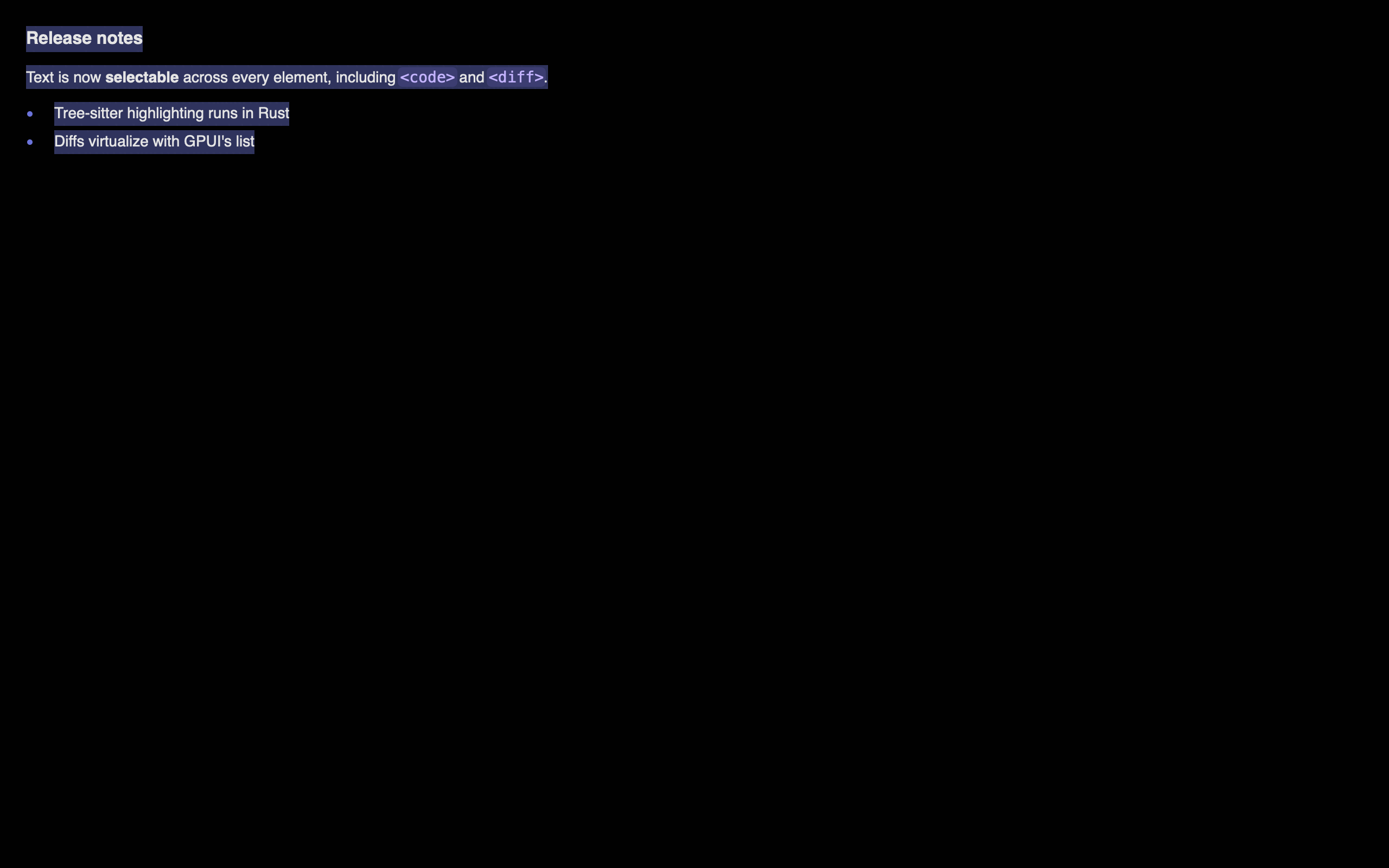
Every text GPUIX paints is selectable and copyable, including text inside
<code>, <diff> and <markdown>. A drag that starts in a heading and ends
inside a fenced code block selects everything between; Cmd+C copies it joined in
document order.
There is nothing to opt into. A tap does not select. Only a drag does.
To opt out — toolbars, buttons, line-number gutters — set
userSelect: "none", which inherits like the CSS property:
123<divstyle={{ userSelect:'none'}}><text>toolbar label, never selected</text></div>
Read the selection from the renderer, or react when it changes:
12345678render(<App/>,{onSelectionChange(event){setCopied(event.value??'')},})
renderer.getSelectedText()// joined text, or null
renderer.clearSelection()
onSelectionChange is a window-level callback on render() / createRoot(),
the same attachment as onKeyDown. Text selection is app-wide, not per element.
It fires once when the selected ranges change, including a clear to empty
(value is then omitted). An unchanged frame does not fire.
The payload is a normal EventPayload. value is the joined selected text.
Selection works because each painted text element registers itself into a
per-frame registry in paint order, which is document order. A drag anchored
in one element resolves against that registry into per-element spans: partial in
the anchor and head, whole for everything between.
Why not one big text element, like Zed?
Zed's markdown selects continuously because its whole document is a single
element over one text model. GPUIX renders a tree of text elements, so it
rebuilds that continuity at paint time instead. The mechanism is ported from
Comet (MIT), which faced the same problem.
Text highlighting and search
The highlight prop paints a background wash behind matched text. Put it on
any element and it applies to that element's subtree, so the root searches the
window and a container searches only that container.
123<divhighlight={{ query:'fox'}}><text>the quick brown fox</text></div>
It reaches <text>, <code>, <markdown> and <diff> with no extra props,
because every string GPUIX paints goes through the same funnel.
A find bar
useTextSearch owns the cursor and the count. next and previous are plain
event handlers, so nothing here needs an effect.
When you already have offsets, from an LSP range or your own model, pass them
instead of a query. They are [start, end) in UTF-16 code units, the units
indexOf and RegExp.exec return.
A pair that splits a surrogate pair is rejected, never snapped. Ranges index
retained text only; native elements build their strings in Rust, so use query
for those.
Options
field
meaning
query
substring to match, case-insensitive by default
caseSensitive
exact case only
wholeWord
neither neighbour may be alphanumeric or _
ranges
explicit [start, end) UTF-16 pairs
color / activeColor
any CSS colour; defaults come from the theme
activeIndex
which match gets activeColor, for a find cursor
matchIndexOffset
matches before this subtree; only for virtualized content
radius
corner radius of the wash, default 2
Pass an array to paint several at once, for example search matches plus a
persistent mention tint. Later entries draw on top.
Matching rules
Matches are non-overlapping and leftmost-first. Case-insensitive matching
uses Unicode lowercasing, not full case folding, so ff does not match ff.
A word boundary is any code point that is not Unicode Alphabetic, a digit,
or _.
A match never crosses a line, exactly like browser find. It does cross the
several host nodes React creates for one interpolated line, which matters more
than it sounds:
1234// React makes 3 host text nodes here. `Hello Tommy` still matches.<divhighlight={{ query:'Hello Tommy'}}><text>Hello {name}!</text></div>
The nearest declaration wins, so a nested highlight replaces its ancestor's
for that subtree.
userSelect: "none" does not opt out of search. A browser still finds that
text, so GPUIX still highlights it. Only element chrome, a code gutter or a diff
file header, is excluded.
Searching a virtual list
<virtual-list> never builds off-screen rows, so native can only see the
mounted window. Two things follow, and both are the app's job because the app
owns the row data.
Count the matches yourself with findRanges, which runs the same algorithm
as the native matcher on a string you give it.
Say where your window starts, as a count of matches above it, not a row
index. Without it native numbers the mounted rows from zero, activeIndex means
"the nth visible match", and the find cursor lands on the wrong row.
Both numbers travel together in matches, because supplying one without the
other is always wrong.
123456789101112131415161718import{ findRanges, useTextSearch }from'@gpuix/react'// One entry per row, so a prefix sum gives both numbers.const perRow =useMemo(()=> rows.map((row)=>findRanges({ text: row.text, query }).length),[rows, query],)const search =useTextSearch({
query,
matches:{
total: perRow.reduce((n, count)=> n + count,0),
indexOffset: perRow.slice(0, windowStart).reduce((n, count)=> n + count,0),},})// search.next() moves the cursor; you do the scrolling
listRef.current.scrollToItem(rowOfMatch(search.active))
findRanges matches the native algorithm for the same string. Call it on
the same logical lines native paints: adjacent text nodes of one parent are one
line, and <markdown> paints inline runs rather than its source.
Why a wash and not gpui's HighlightStyle
HighlightStyle.background_color is painted natively by gpui, but only with
square corners, and it cannot report the boxes it drew. GPUIX paints quads from
range_rects, the same helper selection and inline-code pills use, so a
soft-wrapped match is one box per visual row and getPaintedHighlights() can
assert the geometry without a screenshot. Zed's own editor paints search
highlights manually for the same reason.
Native text components
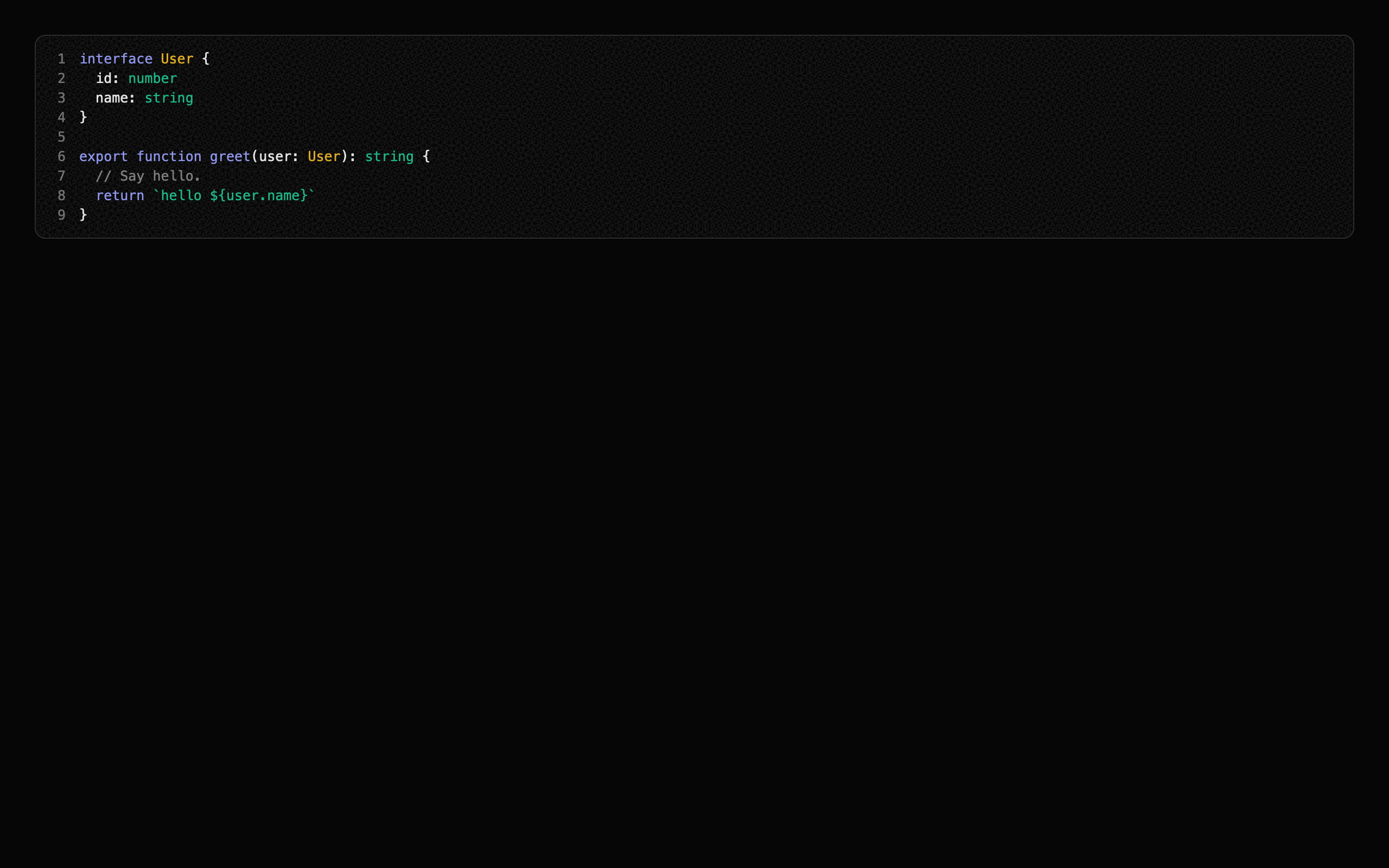
Three elements render text with Syntect syntax highlighting computed in
Rust. Colours come from a theme prop, so a late-arriving highlight recolours runs
without ever changing layout.
<code>
A syntax-highlighted code block. One row per line at an exact line height, so the
block's height is known before highlighting runs.
It paints no surface of its own: no fill, border, radius, padding or language
header. style is the surface, so the card look is yours.
123456789101112<codecode={source}language="typescript"// or path="src/app.ts" to detect from extensionshowLineNumbersstyle={{
padding:12,
borderRadius:10,
borderWidth:1,
borderColor:'#ffffff1f',
backgroundColor:'#ffffff09',}}/>
fontFamily, fontSize, fontWeight, lineHeight and color in style beat
the theme. Rows are a fixed height, so fontSize alone scales that height by the
theme's ratio; pass lineHeight to set it exactly.
Two things stay owned by the element: lines never wrap, and the block is its
own horizontal scroller. A long line pans on a horizontal wheel inside it, so
whiteSpace and overflowX in style do nothing.
For a language header, or any other chrome, wrap it in a <div> you own:
<markdown> is different: it keeps its own fenced-block card, because a document
renderer owns its layout. Tune that card with the mdCode* metrics.
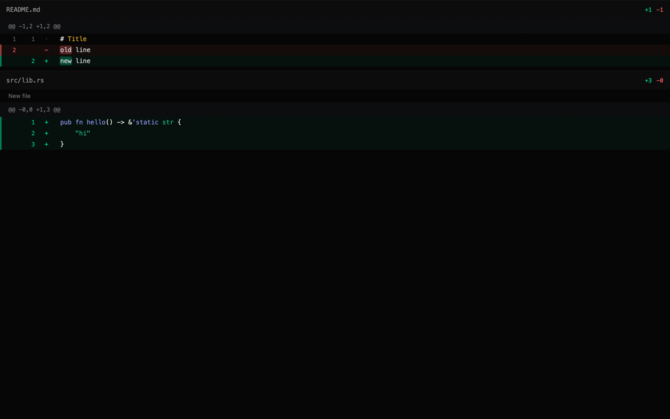
<diff>
A unified diff viewer. It flows with its parent by default, so a parent
list can be the only scroller. Collapsing a file removes its rows rather than hiding
them, so a collapsed 10k-line file costs one row.
Use maxLines to keep a long patch short. Show more fires onShowMore. Clear
maxLines in that handler to reveal the rest.
Pass scroll and a bounded height only for a dedicated full-window viewer.
That path uses GPUI's list() and virtualizes. Do not nest it inside another
scroller. See Scrolling.
123456789<diffpatch={unifiedPatch}wordDiff// highlight only the tokens that changedmaxLines={open ?undefined:24}collapsedPaths={['pnpm-lock.yaml']}onShowMore={()=>setOpen(true)}onToggleFile={(e)=>toggle(e.value)}onLineClick={(e)=>console.log(e.oldLine, e.newLine, e.value)}/>
<markdown>
GitHub-flavoured markdown: headings, lists, tables, block quotes, fenced code,
strikethrough, task lists, and autolinked bare URLs.
All three take the same optional theme prop. Every field layers on top of the
built-in dark theme, so overriding one token leaves the rest alone.
123456789<codecode={source}language="rust"theme={{
appearance:'dark',// or 'light'
accent:'#7c86ff',
syntax:{ keyword:'#f38ba8',string:'#a6e3a1'},}}/>
Layout numbers live in the theme too, under metrics. Row heights, gutter
widths, paddings and the heading scale are props, not Rust constants, so tuning
the design is a React re-render and never a native rebuild.
When scroll is on, <diff> virtualizes from these numbers without measuring,
so changing diffLineHeight also re-sizes the scroll model.
The same three components, retuned entirely from metrics with no rebuild:
Languages bundled: Rust, TypeScript, TSX, JavaScript, JSX, Python, Go, JSON,
Bash, TOML, YAML, Markdown, HTML, CSS, C.
Supported Elements
Element
Description
div
Container with flexbox layout
text
Text content, selectable
code
Syntax-highlighted code block
diff
Unified diff viewer. Flows by default
markdown
GitHub-flavoured markdown
input
Native single-line text editor
textarea
Native multiline, auto-growing text editor
virtual-list
Long collections; only visible rows are built
img
Local, data URL, or http(s) raster or SVG images
svg
Tintable monochrome SVG icons from source or disk
anchored
Positioned overlay
canvas
Custom drawing (planned)
Images and icons
<img> takes a filesystem path, data URL, or http(s) URL. Resolve local
files with fileURLToPath or path.join, encode in-memory bytes as base64, or
pass a remote URL and let GPUI fetch it.
<img>
<img> paints through GPUI's image element. It loads PNG, JPEG, WebP, GIF,
SVG, BMP, TIFF, ICO, and Netpbm from disk, data URLs, or http(s). SVG here is a
full-colour image, not a tintable icon.
Set bothwidth and height. GPUI fetches and decodes on a background
task. The tree does not wait. Without a definite size the box is empty until
decode, then jumps to the bitmap size.
Data URLs support every image format listed above. Base64 and percent-encoded
payloads are accepted. Remote URLs use the same GPUI image cache as disk files.
They are not written to a temp file.
objectFit matches CSS: "contain" (default), "cover", "fill",
"scaleDown", or "none". An empty src or a failed load shows a fallback
placeholder instead of crashing. A URL that is still loading paints an empty
box of the declared size. There is no spinner.
borderRadius clips the bitmap. GPUI paints the image with those corner
radii. A parent overflow: "hidden" wrapper does not clip an <img>
child. Put the radius on the image.
A data URL still works, but it base64-encodes the bytes into the mutation JSON.
For a waveform, a canvas dump, or any frame you already have in memory, push
raw bytes through the <img> ref. That call skips JSON.
setImage takes encoded PNG, JPEG, WebP, GIF, SVG, BMP, TIFF, ICO, or
Netpbm. setImagePixels takes packed RGBA. Prefer pixels for a live
waveform. There is no PNG encode, and no JSON.
Call either from useLayoutEffect after mount. A later React srcchange
overwrites the pixels. Alpha is straight, not premultiplied.
There is no density argument. width and height on setImagePixels are
bitmap pixels. style.width and style.height are the layout box. On a retina
display, upload 2x (or devicePixelRatio) the box size so GPUI does not
stretch one logical pixel into four screen pixels.
getImageData().data is packed RGBA. That is what setImagePixels wants.
Do not use node-canvas toBuffer('raw'). That buffer is BGRA or ARGB, native
endian, and may include stride padding.
The waveform example writes the same RGBA layout by
hand, at 2x.
<svg>
<svg> uses GPUI's monochrome icon renderer. Raw source works on desktop
and in the browser. Desktop apps can also use a local src path. The icon is
drawn as one shape and tinted with style.color.
For application icons, prefer raw SVG source. It works with both GPUIX
targets and lets a bundler embed each icon in the JavaScript bundle. Use src
only for a desktop app that intentionally ships loose asset files.
src is a filesystem path or a data:image/svg+xml,… URL. Vitest and some
Bun import … with { type: 'file' } bindings emit the data URL. GPUIX decodes
both.
style.color is required. Without it the icon does not paint. Prefer
fill="#000" or stroke="#000" in the file. currentColor in the SVG is not
the same as style.color.
Bun
Use Bun's text loader. The import
is a string containing the complete SVG, and bun build embeds it in the
bundle.
Node.js also has text modules,
but they currently require --experimental-import-text. Prefer
readFileSync until
text imports no longer need a runtime flag.
Supported Events
Event
Props
Payload fields
Click
onClick
x, y, button, clickCount, isRightClick, modifiers — primary button only
Aux click
onAuxClick
x, y, clickCount, isRightClick, modifiers — non-primary buttons
Mouse down
onMouseDown
x, y, button, clickCount, modifiers
Mouse up
onMouseUp
x, y, button, clickCount, modifiers
Mouse enter
onMouseEnter
hovered
Mouse leave
onMouseLeave
hovered
Mouse move
onMouseMove
x, y, pressedButton, modifiers
Click outside
onMouseDownOutside
x, y, button, modifiers
Key down
onKeyDown
key, keyChar, isHeld, modifiers
Key up
onKeyUp
key, keyChar, modifiers
Focus
onFocus
—
Blur
onBlur
—
Scroll
onScroll
deltaX, deltaY, precise, touchPhase, modifiers
File drop
onFileDrop
paths, x, y — Unicode filesystem paths from Finder or the OS
Change
onChange
value — <input> and <textarea> only
Submit
onSubmit
value — <input> always, <textarea> when onSubmit is set
Toggle file
onToggleFile
value (file path) — <diff> only
Show more
onShowMore
value (hidden line count) — <diff> only
Line click
onLineClick
value, oldLine, newLine — <diff> only
Link click
onLinkClick
value (URL) — <markdown> only
Selection change
onSelectionChange
value (joined selected text) — window-level on render()
A Finder or OS file drop lands on the hovered element that lists
onFileDrop. paths is an array of absolute Unicode filesystem paths.
x and y are the drop point in window pixels. An empty drop, or a drop
that contains a non-Unicode path, does not fire.
Put the listener on a div, text, img, svg, input,
textarea, code, markdown, diff, or anchored.
<virtual-list> does not take this event. Wrap it:
Keyboard and focus listeners create a persistent GPUI FocusHandle
automatically. A listener alone does not put a div in the Tab order; add
tabIndex={0} for that. Inputs and textareas already use tab index 0.
A node that listens for both onMouseDown and onMouseMovecaptures the
pointer, like HTML setPointerCapture.
onMouseMove and onMouseUp keep firing after the pointer leaves the hitbox,
leaves the parent, and leaves the window. A node with only onMouseDown /
onMouseUp does not capture, so a click still ends if you release outside.
Capture is armed by the press itself, so put all three listeners on the
element the user grabs:
A full-window overlay mounted on the press cannot replace this. The overlay does
not exist yet when the press happens, so it never arms capture, and a release
past the window edge is lost. Only the pressed element receives moves while the
gesture runs, and only the hovered element receives them otherwise, so the cost
is one event per pointer move.
Capture arms on the left button only. A right-button drag is not captured,
so it ends when the pointer leaves the element.
onClick fires on primary-button mouse-up. Use onAuxClick for the others,
and read event.isRightClick. onMouseDown and onMouseUp see every
button through event.button (0 left, 1 middle, 2 right).
GPUIX styles look like CSS but are not CSS. A few differences trip
everyone up on the first project:
div is block, not flex. Set display: "flex" before using
flexDirection, gap, alignItems, or alignSelf. Without it those
props are silently ignored.
A flex child that must shrink needs minWidth: 0. Same rule as CSS,
but easier to miss because there is no browser DevTools to inspect.
No shorthand values.padding, margin, and border take numbers.
CSS strings like "0 16px", "1px solid #fff", or calc() are ignored.
boxShadow is a structured object, not a CSS string. See below.
No <button>. Use <div onClick> with cursor: "pointer".
Do not nest <text> in <text>. Adjacent <text> siblings merge
into one line. A <text> child of another <text> is a nested div.
<input> has no default inner padding. Set padding on the input
style, or pad the parent wrapper. The input clips to its own
borderRadius automatically.
Position:position ("relative" | "absolute" | "fixed"), top, right, bottom, left — "fixed" lays out like "absolute", because GPUI has no scrolling document to be fixed against
none components and the parser's limited relative-color from / calc()
forms.
Standard comma and modern space/slash alpha forms work. Values are converted
to hard-clipped sRGB before GPUI paints them. Invalid strings are ignored for
that property; they do not reject the full style object.
Linear gradients
background accepts GPUI's native two-stop linear gradient. Angles follow
CSS: 0 points up and values increase clockwise. Stop positions use 0 to 1.
colorSpace is optional and defaults to "srgb". GPUI also supports
"oklab". It does not support radial, conic, repeating, or gradients with
more than two stops.
hsv(), hsva(), and hwba() are parser extensions rather than CSS Color 4
standard functions. color(), platform/dynamic colors, and numeric color
integers are not accepted.
Selection:userSelect ("text" | "none"), selectionColor — both inherit down the tree
Hover and active
hover and active are nested style objects. GPUI applies them natively
when the pointer is over the element or the mouse is down. There is no
JavaScript round trip.
Nesting is one level deep. A hover object cannot contain another hover or
active.
They work on every element, including <text>, <code>, <markdown>,
<diff>, <img>, <svg> and the editors. The one exception is
<virtual-list>, whose style type rejects them: gpui's list has no
interactive identity to hold a hovered or pressed state, so put them on a
wrapping <div>.
Note: white-space: pre is not supported. GPUI's text system only has normal (wraps) and nowrap (single line). To preserve newlines like HTML <pre>, split your text on \n in React and render each line as a separate <text> element in a flex column:
Note: GPUI defaults text color to black, not white. Unlike CSS, GPUI does not inherit color from parent elements. Every <text> element that doesn't set an explicit color style will render as black — invisible on dark backgrounds. Always set color on your text elements or on a parent <div> (which applies text_color to all children in that subtree via GPUI's Styled trait).
Automation
Mark elements with testId, then drive them like Playwright. The same
client works in vitest, inside browser pages, and against a child process.
Mouse actions use the normal GPUI input path in all three hosts.
Every browser render installs the automation App as globalThis.gpuix.
It is always available after render() returns. No setup flag or separate
transport is required.
123456789101112await page.evaluate(async()=>{await globalThis.gpuix.getByTestId('sidebar-collapse').click()await globalThis.gpuix.getByTestId('composer').fill('hello from Playwriter')await globalThis.gpuix.clock.pause()await globalThis.gpuix.clock.fastForward(200)})
The browser global supports locators, input, tree and text queries, bounds,
selection, scrolling, focus, and clock control. Browser pages cannot write an
arbitrary local screenshot path. Use the controlling browser tool for that:
Bounds come back in canvas pixels, not CSS pixels, because that is the
coordinate space GPUI lays out in. On a 2x display a locator at x: 44 sits at
CSS x: 22. Convert before handing a rectangle to a browser tool:
Do not read window.devicePixelRatio for this. An automation tool can override
the viewport scale factor after GPUI has already sized its canvas, and then the
two disagree.
Locators
Call
Matches
app.getByTestId('send')
The testId prop
app.getByText('New chat')
A node's own text
app.getByType('textarea')
The host element type
locator.getByText('...')
A descendant of another locator
click() hits the center of the last painted bounds. fill(text) replaces the
focused editor contents. press('enter') sends one key. waitFor() polls until
exactly one match exists. textContent() returns the node's own text plus every
descendant's, like DOM textContent.
Mouse, wheel, and drag
Call
What it does
locator.hover()
Moves the pointer to the center, so hover styles and tooltips fire
locator.wheel(dx, dy)
One wheel event over the center
locator.dragBy(dx, dy)
Presses on the center, travels, releases
locator.dragTo(target)
Same, ending on another locator or a { x, y } point
app.mouse.move / down / up / click
Raw pointer input in window coordinates
app.mouse.wheel(target, dx, dy)
A wheel over a point or a locator
app.mouse.drag(from, to)
A drag between two points, two locators, or a mix
A drag sends interpolated moves, not one jump, because snapping, live
previews, and per-move commits only appear when the pointer travels. Pass
steps to control how many, and offset to press away from the center.
Every mouse call takes modifiers in the same syntax as press('cmd-a'),
so cmd-wheel zoom, shift-click range selection, and alt-drag duplication are all
testable:
click() needs painted bounds. Every element that accepts testId records
them, including <img>, <svg> and <anchored>. An <anchored> reports the
box of the overlay itself, not of the trigger it is anchored to, so click()
lands on the menu even when it is deferred and snapped back inside the window.
<virtual-list> is the exception, and it takes no testId. gpui's list is not
an interactive element, so it has nothing to record a box against. Put the
locator on a wrapping <div>.
Screenshots and clock
app.screenshot({ path }) writes the current GPU frame as a PNG.
app.clock.pause(), set(ms), and fastForward(ms) freeze native motion time.
Use that to capture a sidebar animation at known timestamps:
launch({ command, args }) starts the app and speaks the same commands
over stdin as SSE data: lines. The app listens only when stdin is a pipe,
so a normal terminal run is unchanged. Lines without a data: prefix are
ignored; console.log cannot break a message.
Every live-app check must set GPUIX_BACKGROUND=1, and the app entry must map
that flag to focus: false. On macOS and Windows, automation uses the real
window input and paint pipelines without making the window active, so taking
the user's keyboard has no test benefit. Linux currently ignores focus.
fill() and press() dispatch through the live GPUI window input pipeline, so
native <input> and <textarea> elements receive GPUI's keyboard and IME
handling instead of a test-only input path.
Testing
The locators above sit on a GPU-backed test renderer (TestGpuixRenderer).
It runs the same GpuixView, build_element(), apply_styles(), and event
handlers as production. Test windows are positioned offscreen and rendered by
Metal on macOS or DirectX on Windows. The methods below are the lower-level API
when a locator is not enough.
Platform
Test renderer
PNG capture
macOS
Metal
Yes
Windows
DirectX
Yes
Linux
Not yet
Waiting for GPUI's wgpu headless renderer
123456789101112131415import{ createTestRoot }from'@gpuix/react/testing'const{ root, renderer }=createTestRoot()
root.render(<MyComponent/>)
renderer.flush()// triggers GpuixView::render() on the native GPU// Simulate events through GPUI's native input pipeline
renderer.nativeSimulateClick(50,50)
renderer.nativeSimulateKeystrokes('enter')// Inspect resultsconst events = renderer.drainNativeEvents()
renderer.captureScreenshot('/tmp/test.png')const text = renderer.getAllText()
Testing native elements
getAllText() only sees <text> nodes in the retained tree. <code>, <diff>
and <markdown> paint their text inside GPUI, so use getPaintedText(), which
returns every string painted in the last frame in paint order:
Selection has its own helper. Listeners are registered during paint, so
dragSelect flushes between every step; calling simulateMouseDown / Move /
Up by hand without those flushes selects nothing:
A highlight is a quad, so no amount of getPaintedText() will show it. Use
getPaintedHighlights(), which reports the matched range in UTF-16 units plus
the boxes it actually drew, one per visual row:
12345678root.render(<div highlight={{ query:'quick'}}><text>the quick brown fox</text></div>,)const[hit]= renderer.getPaintedHighlights()expect(hit.text.slice(hit.start, hit.end)).toBe('quick')expect(hit.rects).toHaveLength(1)
Assert numbers, not pixels
For a stateful surface, paint the state you want to assert into a readout
element and read it with textContent(). A screenshot tells you that something
changed; a readout tells you what, and the failure message names the number.
Every test in examples/timeline.test.tsx works
this way, including the drag, trim, snap, and zoom gestures. Keep the screenshot
as well, for a human to look at after the run.
Screenshots land in packages/react/screenshots/ and examples/screenshots/,
both gitignored, so they can be inspected after a run without adding a binary
diff to every commit. The curated set the README links to lives in
docs/images/ and is regenerated with:
1bun scripts/screenshots.ts
Developing the Rust side
JS remount is covered above. There is no hot reload for the native half,
and there cannot be: require() of a .node file calls process.dlopen, Node
has no matching unload, and the live state (GPUI's platform, GPU device, open
window, UI thread, and selection registry) stays inside the loaded library. A
second load would create independent native state while the first library
remains loaded.
The rebuild is fast enough that it does not matter. Measured on an M-series Mac
after touching one file:
Step
Time
cargo check --lib
1.5s
cargo build --lib
4.9s
bun run build:debug (napi)
~2s
One vitest screenshot file
~2s
bun run dev wires that into a loop: it watches packages/native/src,
rebuilds, and re-renders the screenshot tests. Rust edit to fresh PNGs is
about 4 seconds.
123bun run dev # rebuild, re-render the showcase screenshotsbun scripts/dev.ts --shots diff # only tests matching "diff"bun scripts/dev.ts --app native-text # rebuild, restart an example app
Screenshot mode is the better default. Open
packages/react/screenshots/showcase.png in Preview.app, which reloads on
write, and unlike a live window the PNG can also be read by an agent.
Two things avoid the rebuild entirely:
Content already lives in props. Change patch or source and the next
frame shows it.
Design numbers live in theme.metrics. Tuning a row height or heading
scale is a React re-render.
The test renderer uses VisualTestAppContext with a TestDispatcher for deterministic scheduling. Event simulation goes through GPUI's coordinate-based hit testing and dispatch — not synthetic JS events.
Status
React reconciler with mutation-based protocol
Atomic applyBatch() mutation transport through napi-rs and wasm-bindgen